ShopDreamUp AI ArtDreamUp

Deviation Actions


Suggested Deviants


Suggested Collections


You Might Like…


Description
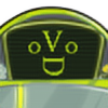
Alright this my entry for the portfolio layout design contest.
****FULLVIEW FOR LAGER IMAGE
****DOWNLOAD FOR EXTRA LARGE IMAGE
Now I'll try to explain functions and such.
1.- Real Name where logo is. It's a must if it's a portfolio, nothing of aliases here, unless you have a nickname between your name, but it isnt prefered. Also the name is to have a link to the portfolio page.
Email, Location, and Speciality: This can be crucial. It is important for the client to know where you live, and most important how to contact you. Specialty is a good thing because it can an idea to the cleint of what you can do best.
*Note: To the left of this area a small logo or personal photo can be placed.
2.- Left Panel - general information.
Ok this requires some javascript, but it would work better with flash. Think of a drop down window when you click on any of the four subjects there. A box of text will drop down with information, however not simultaneously. If you clicked on about, and you click education next, the drop down box for about will close and the drop box of text for education will open up. Something flashy maybe but cool effect. To scrolls thru the text you can use the arrows, or if that seems just out of context a simple side css scroll bar could be used. Also to show which bar is active (even though it would be obvious) the dA logo on the bar will "light up", same thing when you hover over it.
Now information on the about section:
I would limit this to no more than 1000 words, and even then its too much. Most Clients don't want to read mostly about you if they are really looking for someone, but well having something to describe you helps them too.
Information on the Awards:
This can function like the Awards section on the storefront
Information on Education:
Same as above
Information on Skills:
This would actually be a list of 10 or less potencially skills the users has. A two column list with 5 in each side would work best (in my PoV) since it wont make the drop down box longer.
The point of the whole drop boxis to always stay in that size (be it whatever dA's measures would be) so it wont cause more "clutter".
Information on Resume:
This part would be optional. A lot of people do not know what a resume really is, nor how a pdf can be made, but for the good amount of people that might, uploading a resume in PDF format for download can be VERY effective in comparison with just the little information shown on the general information area. That's what the download PDF button is for
For those who cant make a pdf for whatever reason, or if you think a client would prefer to see the resume on plain just text, when the "view online" button is clicked, a new window will appear, with just a plain text resume. Or if it would work better make the online resume the same way you make a journal (without the moods an non-essential things). Or any other neat idea the dA staff can come up with the recommended ones seem a bit limited.
Information on Website and deviant art page link:
The website link is also optional. If no website link is present the table containing the resume and website link would adjust to what there is. If no resume or website link are present, then there should be no box.
The deviant art page link is just a fair link to the user, and just if the client has some curiosity at other works that might not be portfolio material but that still may represent some sort of substancial skill to impress a client. We all have those deviations... or well most.
3. Right Panel - Featured Piece
Just a standard piece to show off. One that the artist might believe that is the strongest piece. I would recommend to the maximum of featured pieces would be two (if that is the case the thumbnails would be reduced), so that the artwork is not overly repeated onsight. The image on this panel would just simply be clicked for the extended sized version. (see below)
4.- Bottom "panel" - Artwork browser
You've seen many of these, and they would work the same. When you hover an image it will "light up" to show it's active.
hover over the arrows on either left and right and the panel will move from side to side. When you click one of the deviations, you will get transferred to the viewing page (which is the bottom picture) in which there's just simply the artist statement about the picture, the picture's title, and the same browser at the bottom. (And also a "back to portfolio" link on the statement. Remember that by also clicking on the Artist's name at the mid top-left corne, the client will be transferred to the porfolio page of the current user.)
Important Note: There will be no looping. Meaning the artwork will stop browsing once it reaches the end of all deviations, same thing for the start of the deviations. This to prevent some confusion, especially if someone has a long list of artwork uploaded for the portfolio. For easier browsing when there's no loop, a horizontal scroll bar would be place on top of the of panel (before the white meets the grey) so that client browsing the works does not get impatient with the speed of browsing arrows, if it would be set to be slow, even though the speed would be moderate. (though there's various way to not make that a problem by adjusting the right speed and even some acceleration).
And that's about it. The middle image, it's just there to show
the representation that it's a portfolio. In other words, its a porfolio bind. It can be taken off.... easely.
And of course copyright statements would be around or not. Since there arent non existent on the storefront pages, i didn't put any, so all to dA's will.
yes all art shown there done by me.
ALL COLORS USED ARE FROM dA! YAY!
Image size
1261x2498px 943.48 KB
© 2007 - 2024 ViralDrone
Comments5
Join the community to add your comment. Already a deviant? Log In
Is your real name Kijuki Magazaki?!
And, I think it's schnazzy!
And, I think it's schnazzy!